
MÔNICA BACKES
Identidade visual / Visual identity
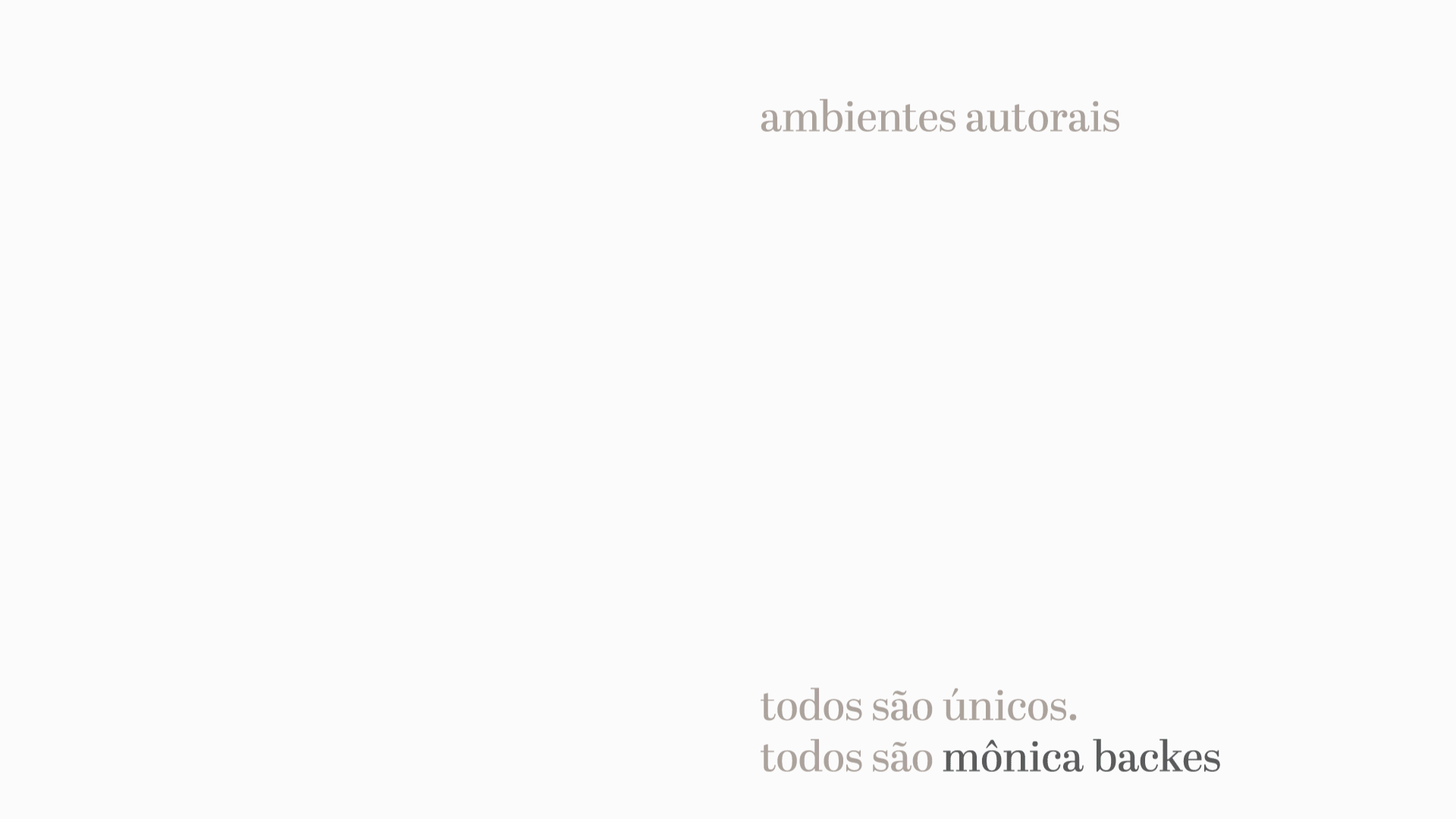
Mônica Backes é uma arquiteta especializada em projetos de interiores em Toledo/PR. Ela é uma pessoa delicada e meiga, e imprime essa delicadeza em seus projetos e na sua forma de atender os clientes. Seu propósito é criar ambientes autorais, ou seja, projetos em que ela pode expressar sua linguagem e ao mesmo tempo traduzir os desejos de seus clientes, criando projetos únicos mas que são reconhecíveis enquanto conjunto.
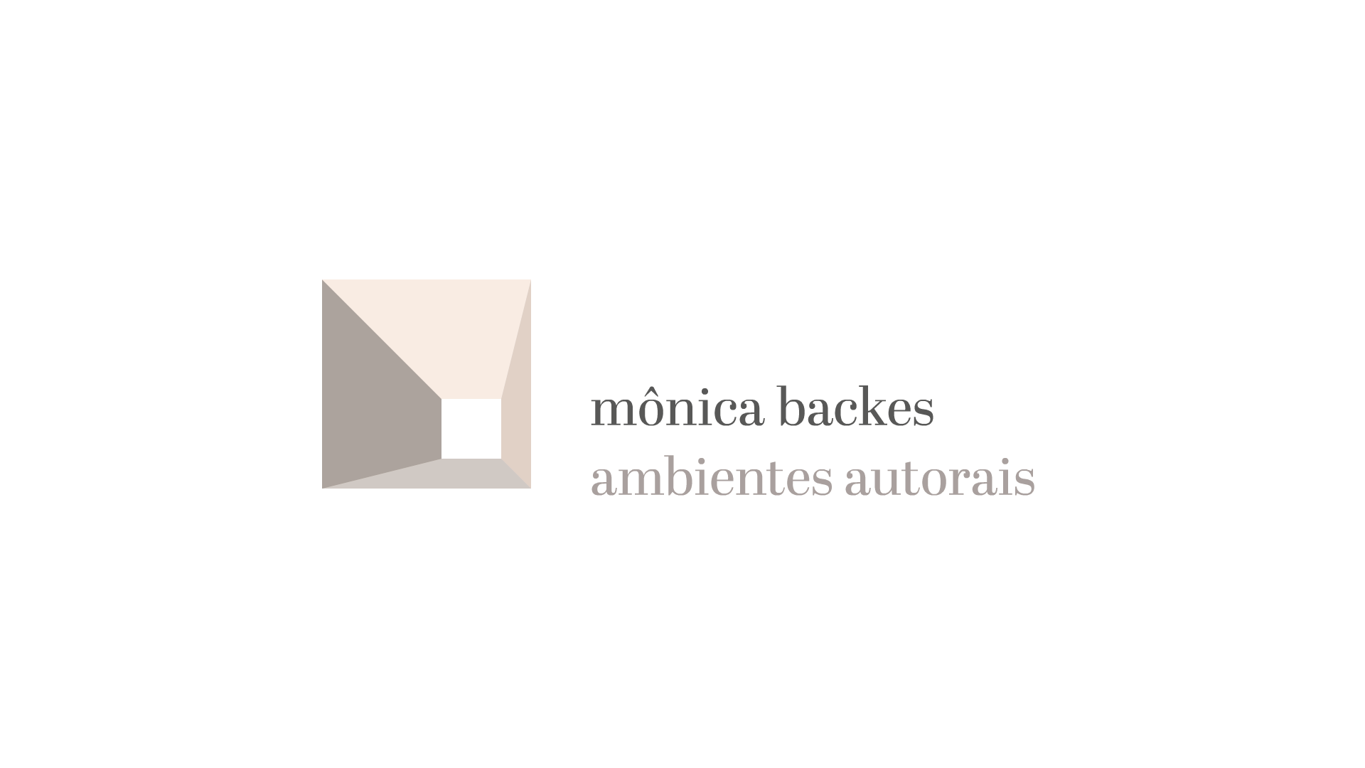
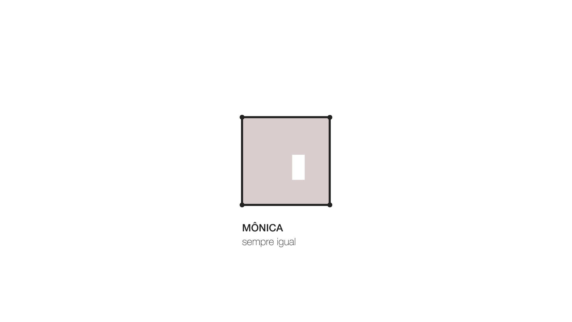
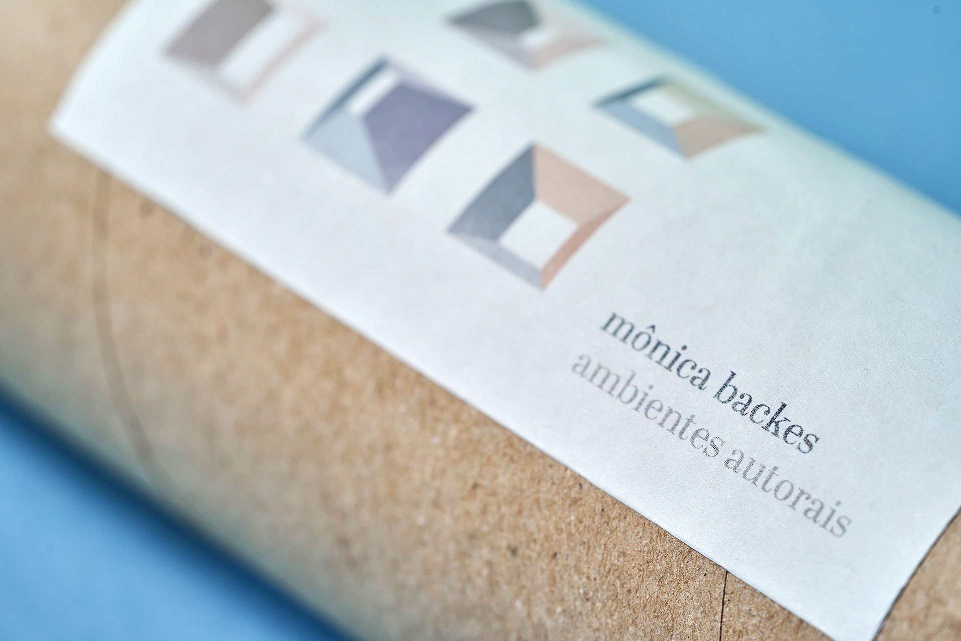
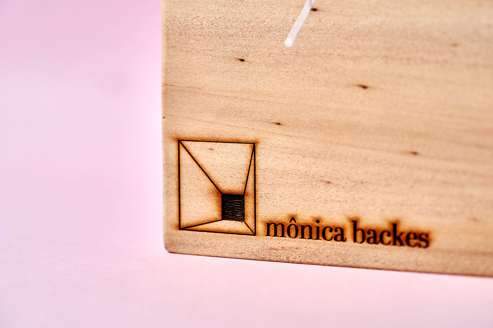
Um ambiente em perspectiva, tomado do posicionamento de marca da arquiteta, é a base para a geração da iconografia. Este espaço assume diferentes geometrias a partir de variações de pontos em um grid. O cliente está sempre no centro do ícone e a sinergia entre Mônica e ele sintetiza a mensagem-chave.
Mônica Backes is an architect specialized in interior design in Toledo, Paraná. She is a sweet and delicate person, and showcase this delicacy in her projects and on her way to address her customers. Her purpose is to create original design, which means that she can express her language and at the same time the wishes of the customers, creating unique projects that can be also recognized as a whole.
A room in perspective, taking the position of the architect, is the basis for the generation of the iconography. This room has different geometries from the variation of the points in a grid. The client is always on the center of the icon and the synergy between Mônica and the client synthesize the key-message.
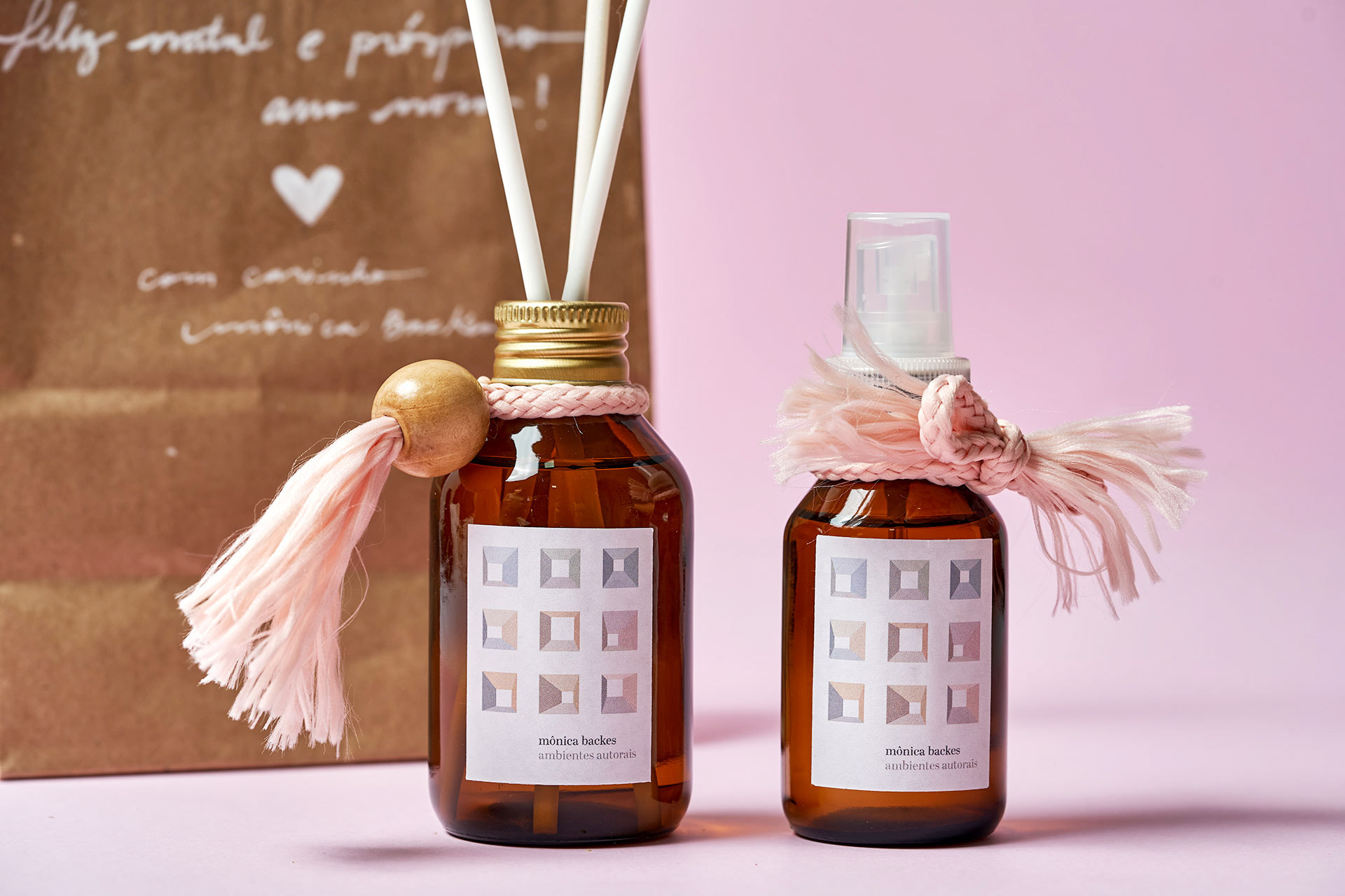
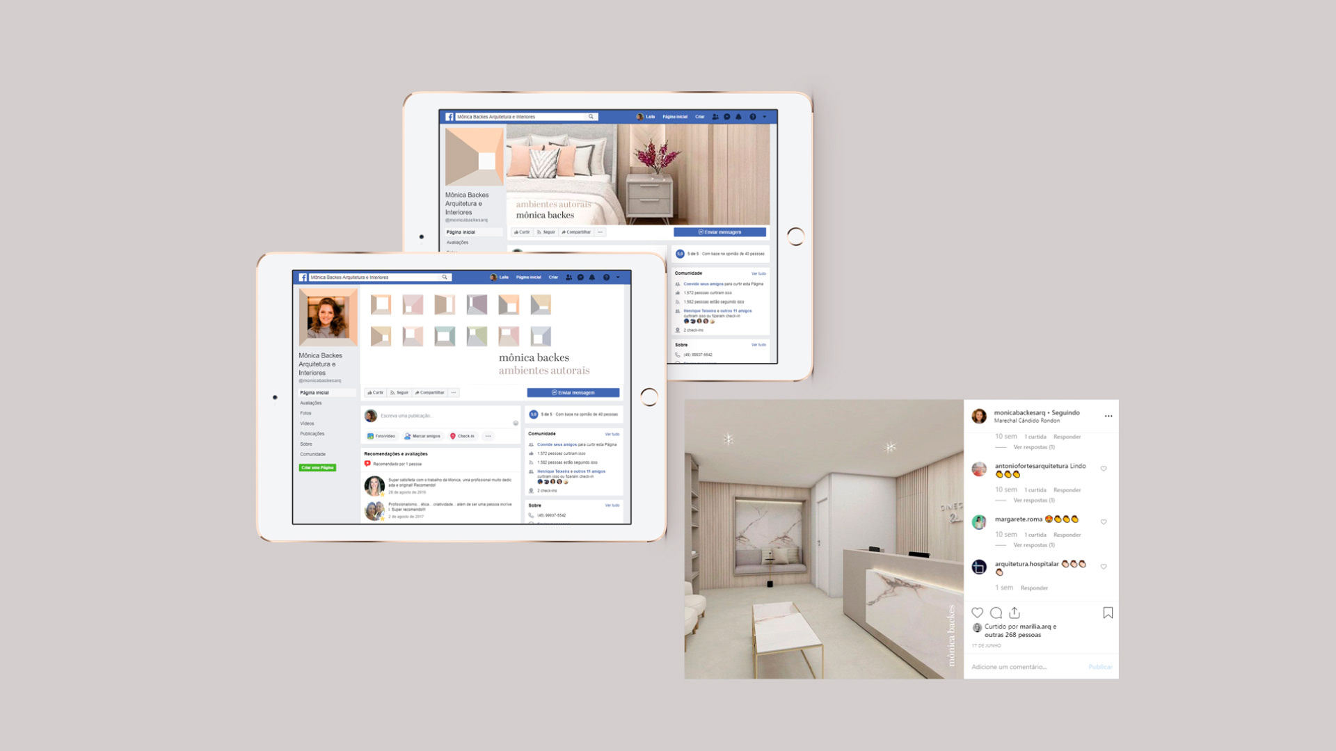
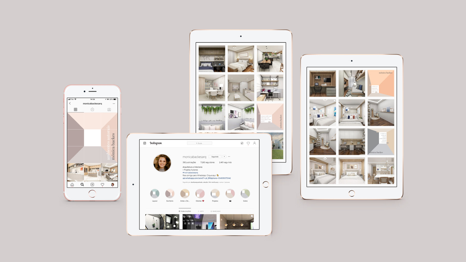
A identidade visual é composta por três elementos independentes, que podem ser aplicados com flexibilidade nos materiais institucionais: a iconografia (em versão única ou múltipla), o nome “mônica backes” e o slogan “ambientes autorais”.
A fonte Abril Display aplicada como texto corrido em caixa baixa evoca um tom mais autoral e menos corporativo, além de colocar cliente e Mônica no mesmo nível.
The visual identity is composed by three independent elements, which can be applied with flexibility on the institutional materials: the iconography (in unique or multiple version), the name "mônica backes" and the slogan "original ambients".
The font Abril Display applied in low case as the text evoque a more original tone, less corporative, as well as put Mônica and the client on the same level.
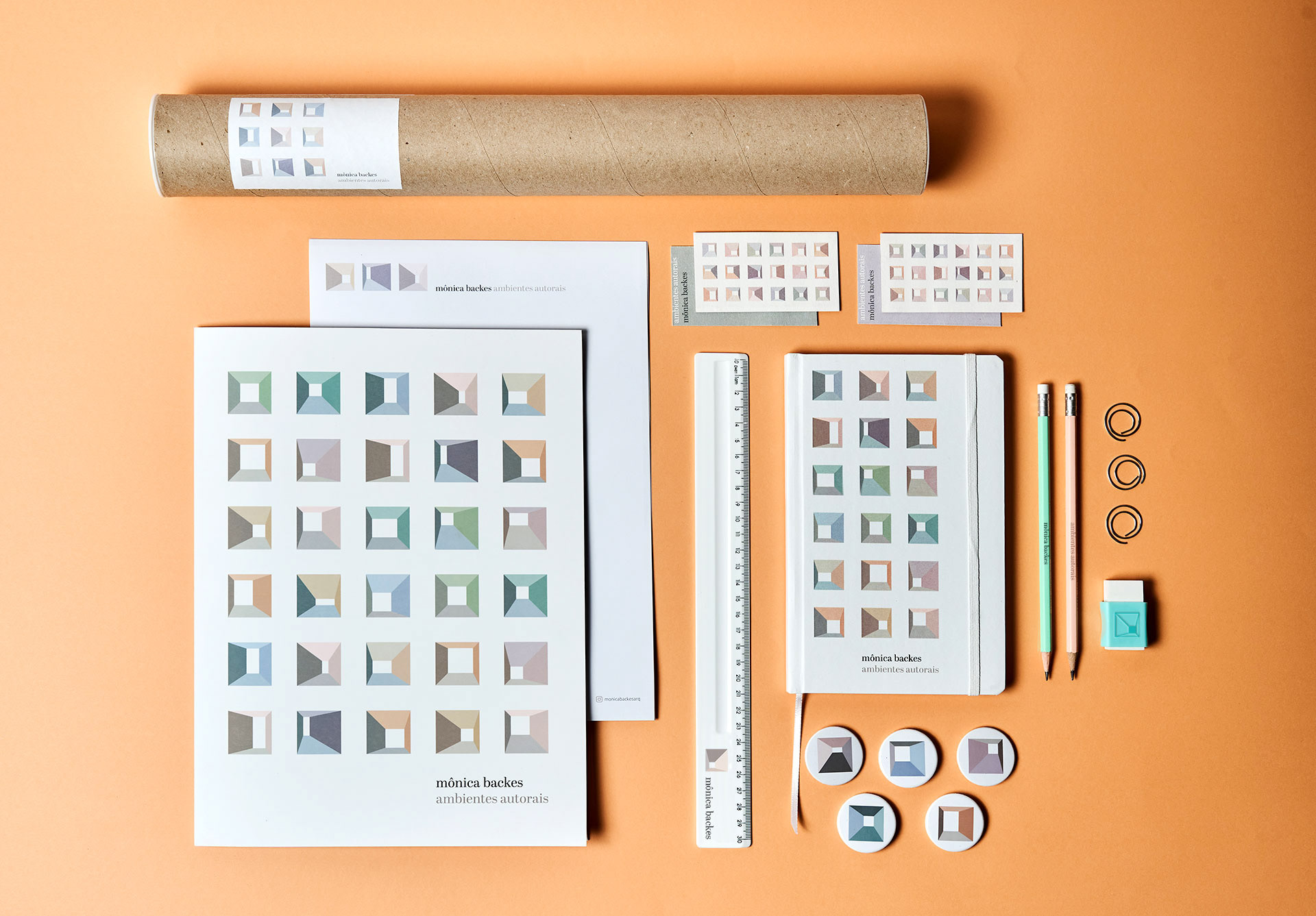
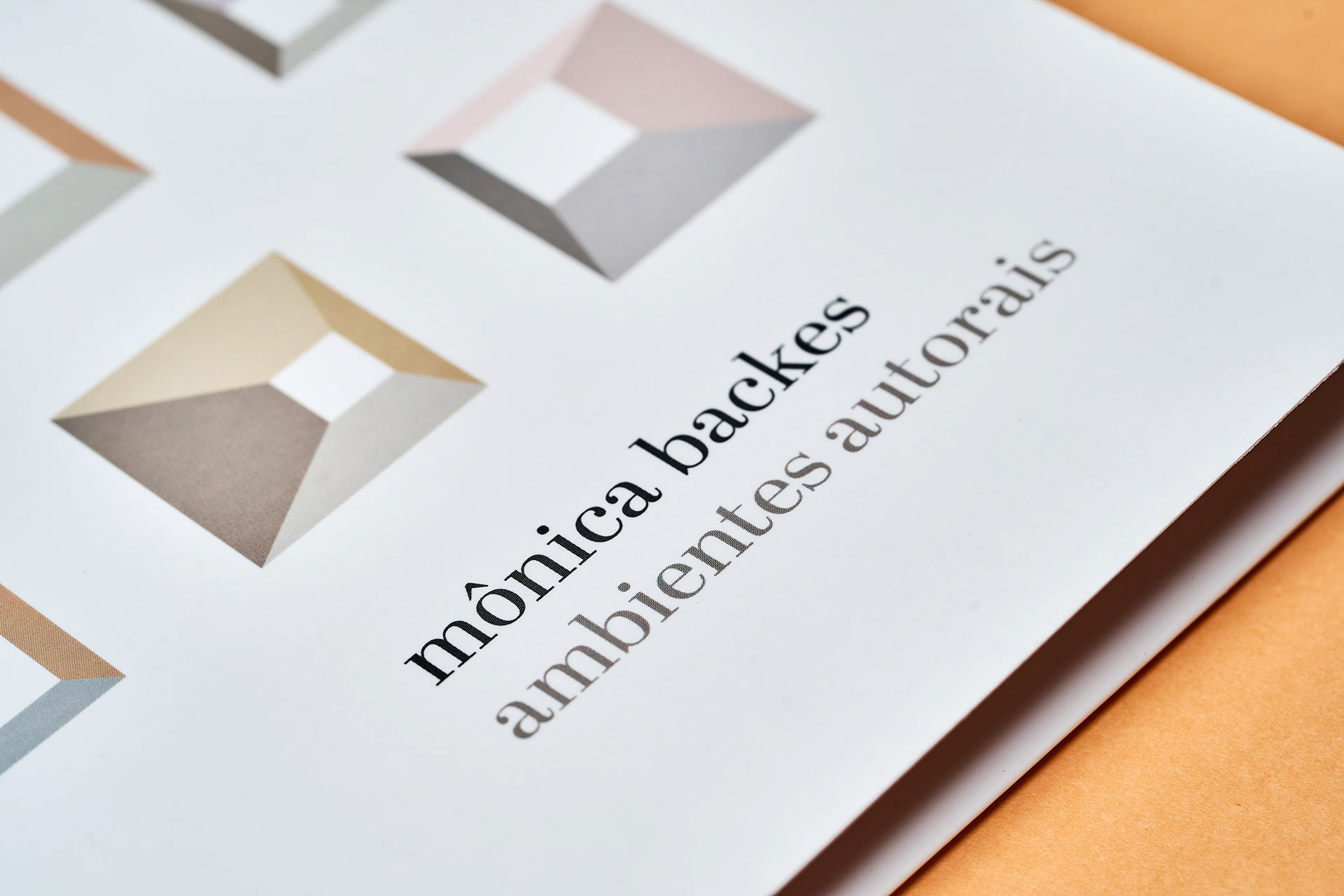
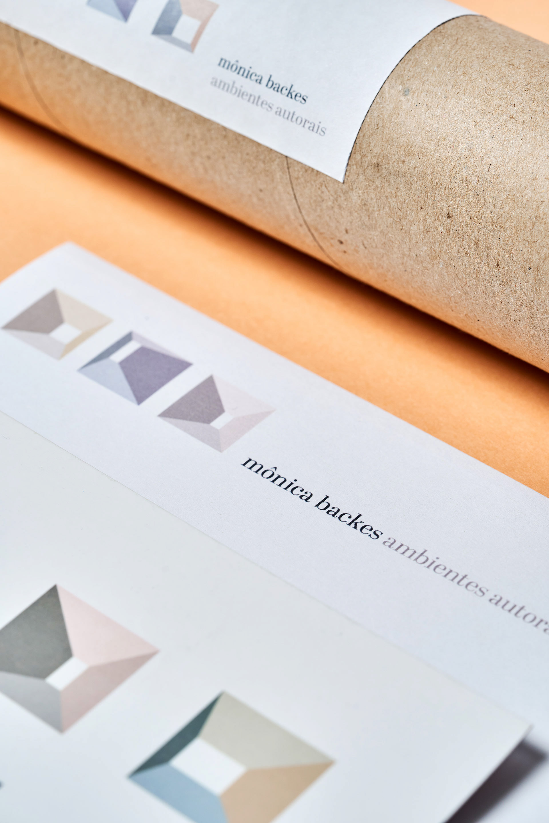
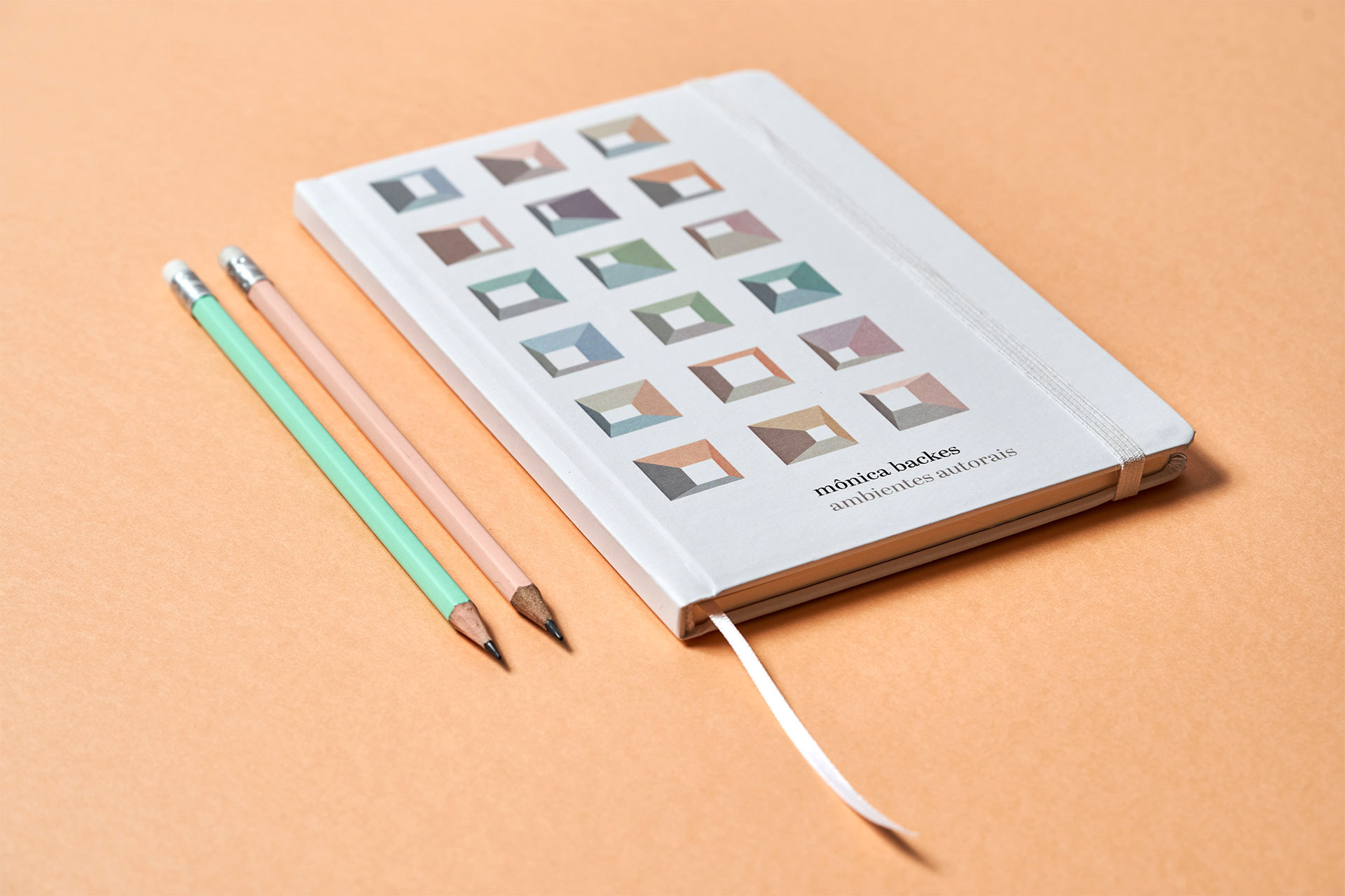
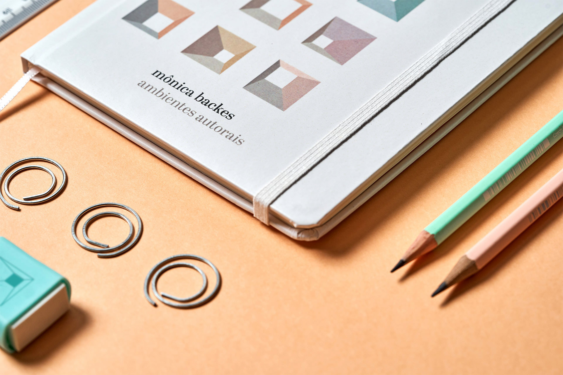


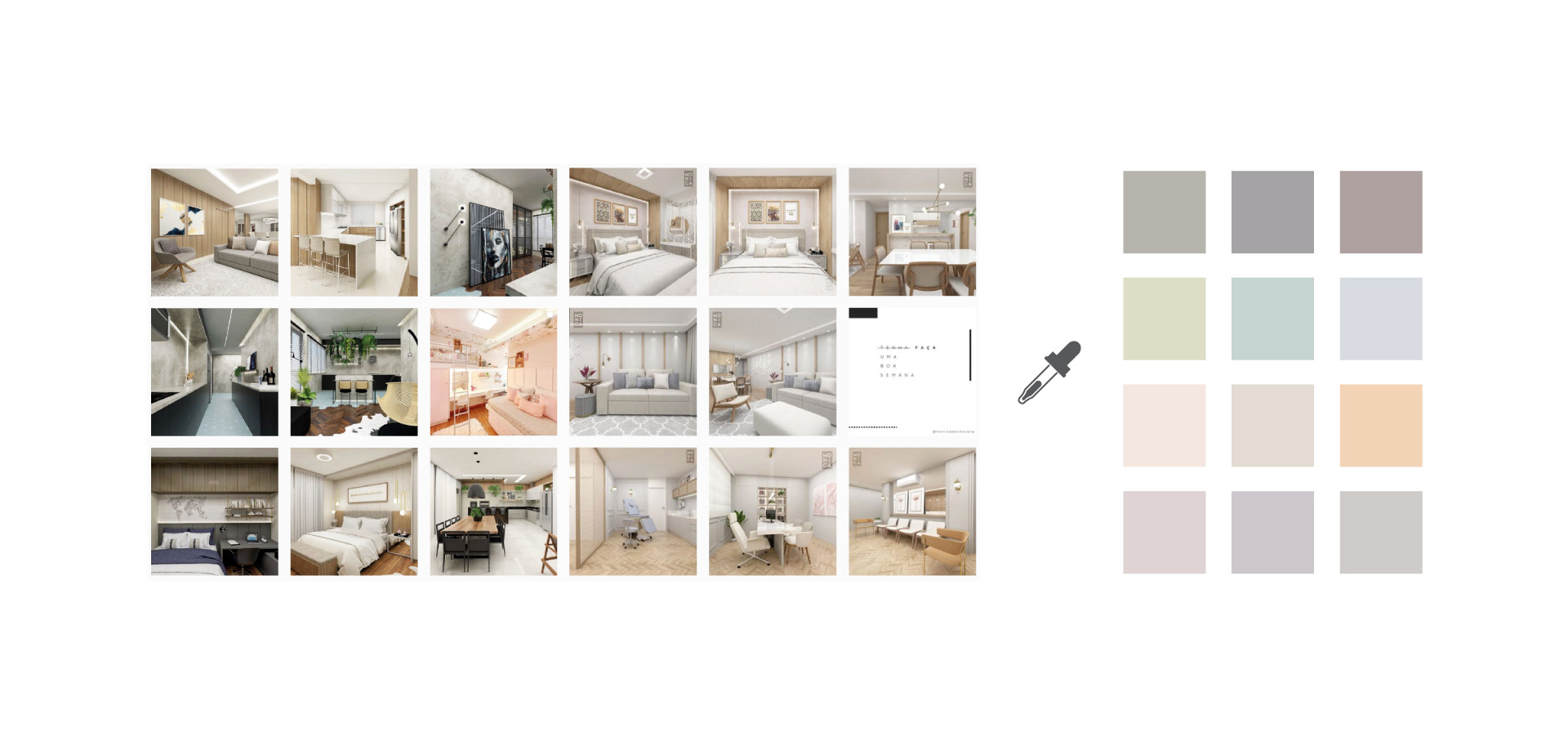
A paleta de cores pasteis é inspirada na delicadeza da personalidade da arquiteta, correspondente aos tons predominantes na linguagem projetual da arquiteta.
The color palette is inspired on the delicacy of the personality of the architect, and correspond to the tones predominantly seen on her design.


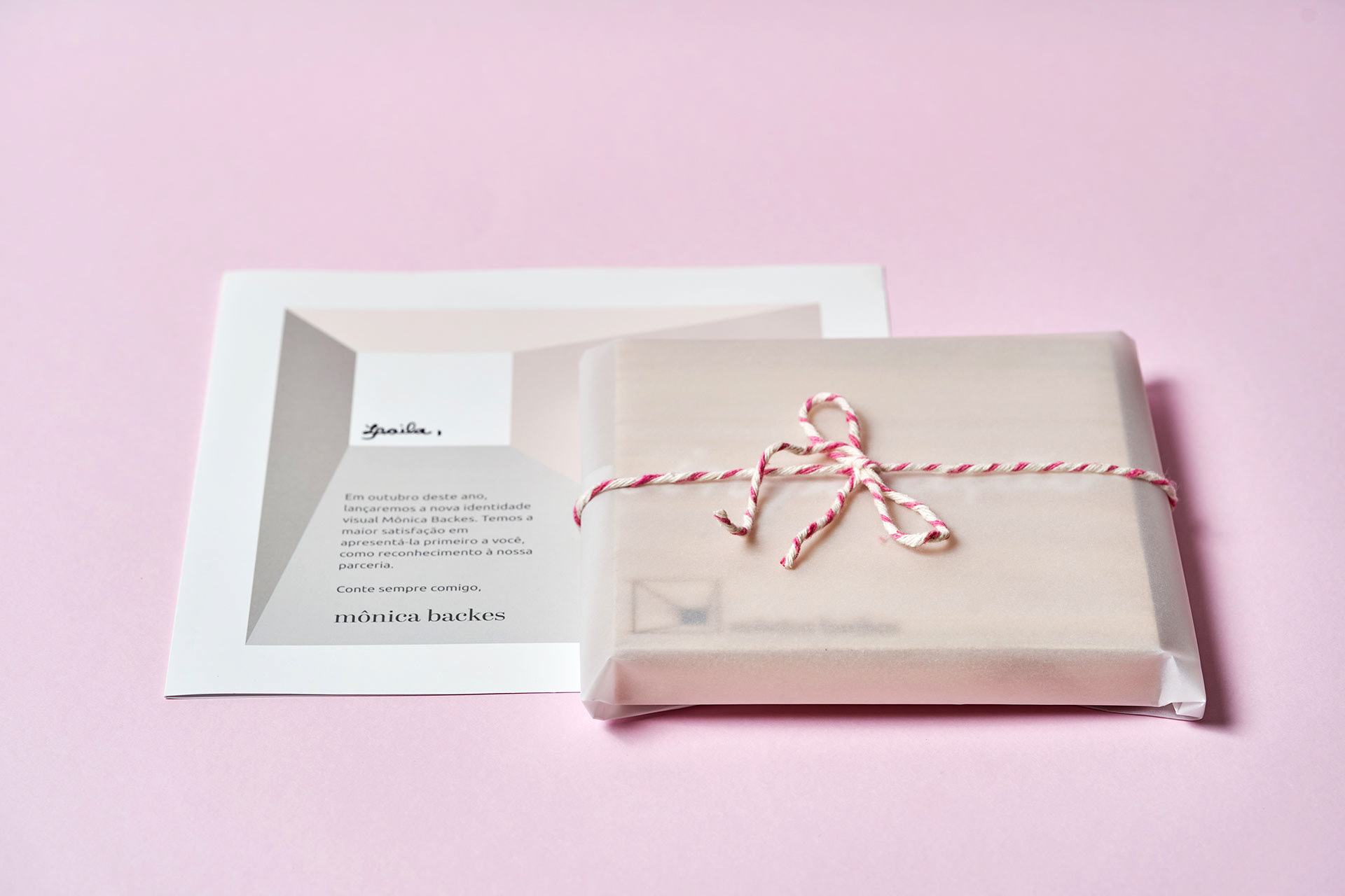
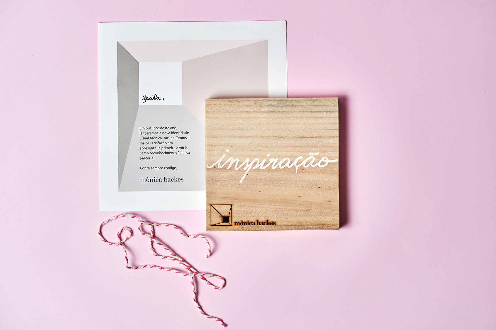
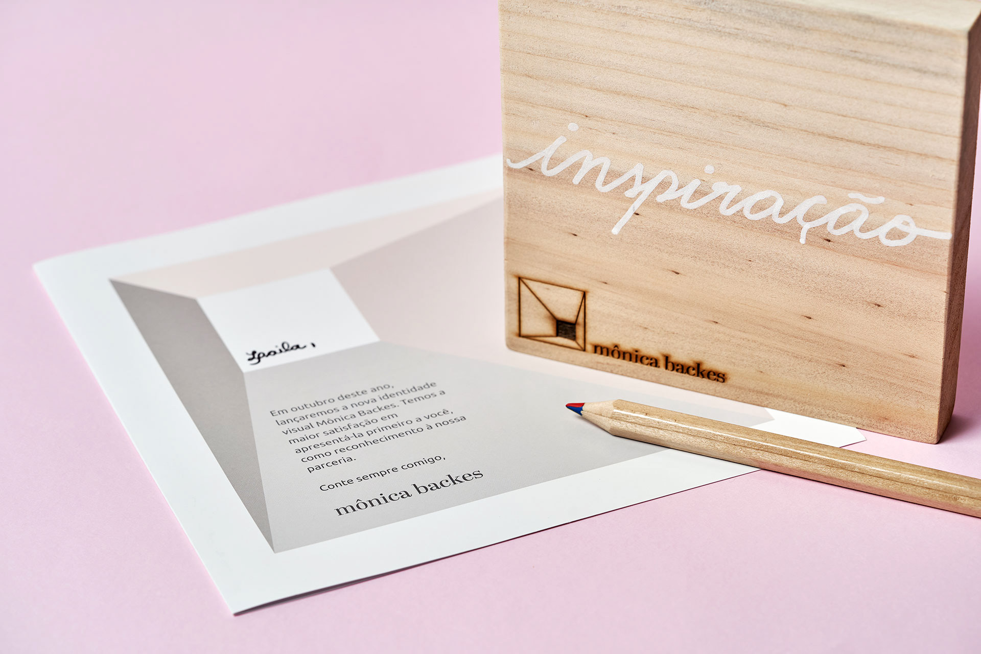
Um dos hobbies da Mônica é desenhar letras à mão - ela faz isso em cartões, quadros, e adora presentear as pessoas. Exploramos essa habilidade em mimos institucionais, inclusive na ocasião do lançamento da marca. Ela criou um quadro, acompanhado de um cartão, para apresentar a nova Identidade Visual aos clientes e parceiros, desenhando à mão sobre madeira uma palavra que a fazia lembrar de cada um dos presenteados.
One of Mônica´s hobbies is calligraphy - she does that in cards, paintings, and loves to give gifts to people. We explored this ability in institutional gifts, including when the brand was released. She created a board accompanied with a card to present the new visual identity to clients and partners, hand drawing a word on wood that reminded her of each person.

FICHA TÉCNICA
Direção de Criação e Direção de Arte: Laila Rotter Schmidt
Planejamento: Senset | Michele Matsuo e Douglas Buettner
Fotos: Rodrigo Vieira
Animação: Felipe Valenciano Cruz

Shortlist no Festival do Clube de Criação do Paraná 2019 - Categoria Design