
ATELIÊ QUADROS E MOLDURAS / ATELIÊ PAINTINGS AND FRAMES
Identidade Visual / Visual Identity
A Ateliê é uma empresa que produz quadros sob encomenda em Cascavel/PR. A dona da empresa, Tatiana, cuida de todos os processos pessoalmente e entende tudo sobre quadros e molduras. Ela sabe indicar o tipo certo de moldura, o vidro ideal, o formato mais equilibrado, o melhor substrato para impressão... Por isso, o céu é o limite para o que se pode criar na Ateliê.
A empresa já existe há alguns anos porém precisava de uma nova marca para posicionar-se no mercado. Buscamos criar uma marca criativa, gráfica, próxima e flexível, que se comunicasse tanto com arquitetos quanto com o consumidor final.
The Atelier is a company that produces paintings under order in Cascavel. The owner of the company, Tatiana, takes care of all the processes personally and understands all about paintings and frames. She known how to indicate the kind of frame, the ideal glass, the format that is more balanced, the best material to print, etc. That is why the sky is the limit for whatever you want to create at the atelier.
The company already exists for some time but needed to have a new brand to re-position itself on the market. We seeked to make a creative brand, graphic, democratic and flexible, that would communicate with architects as well as with the consumer.
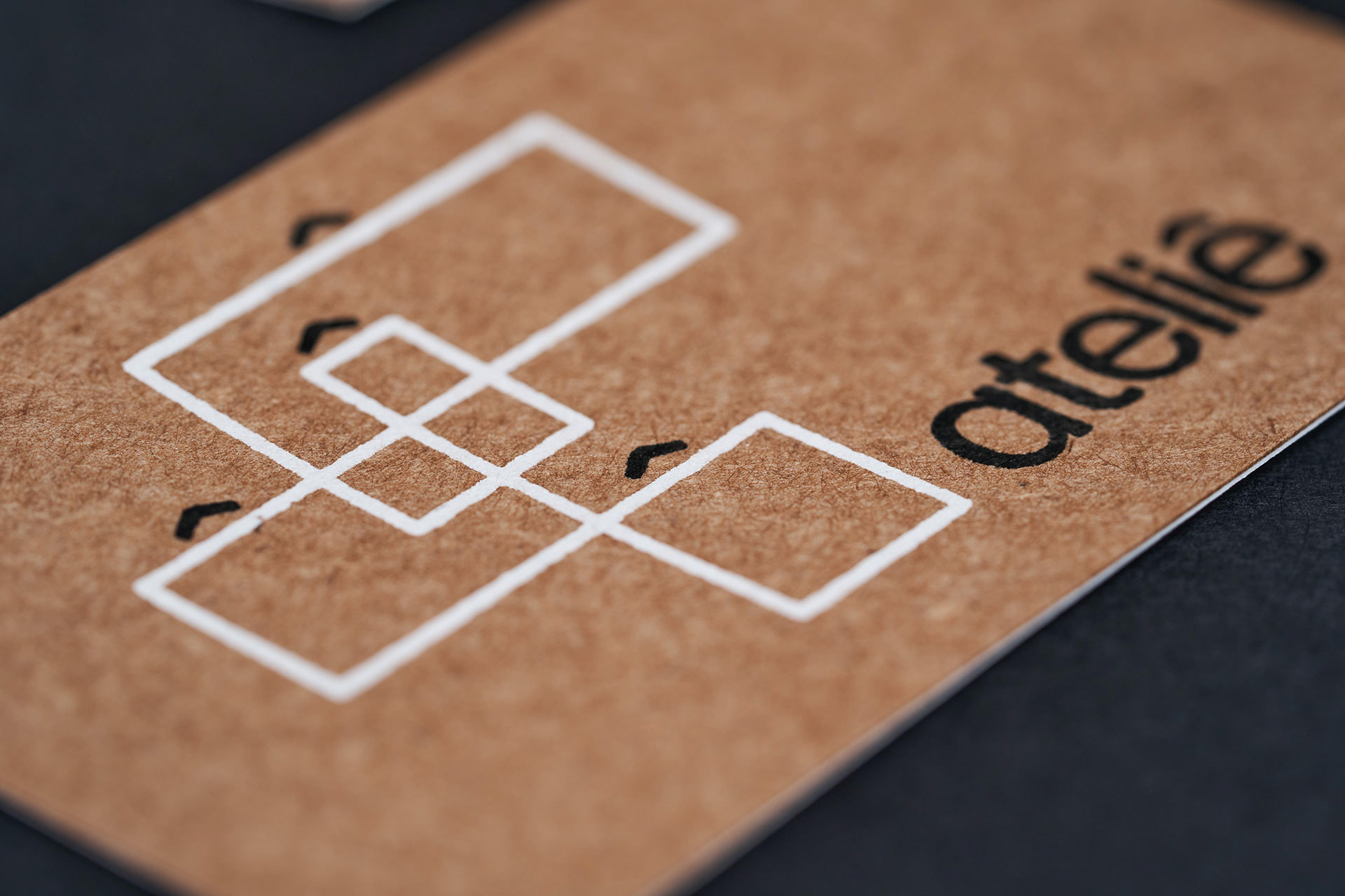
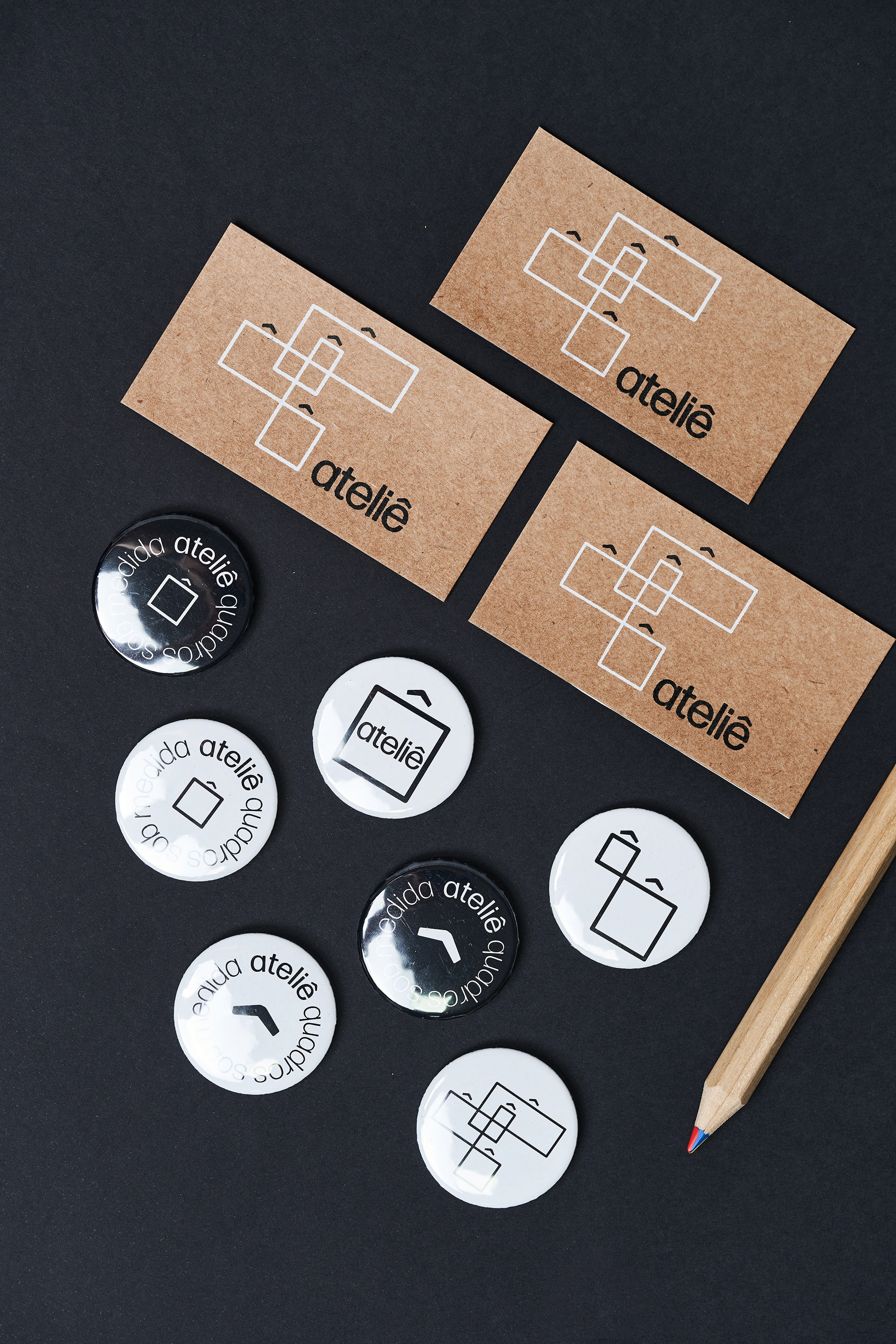
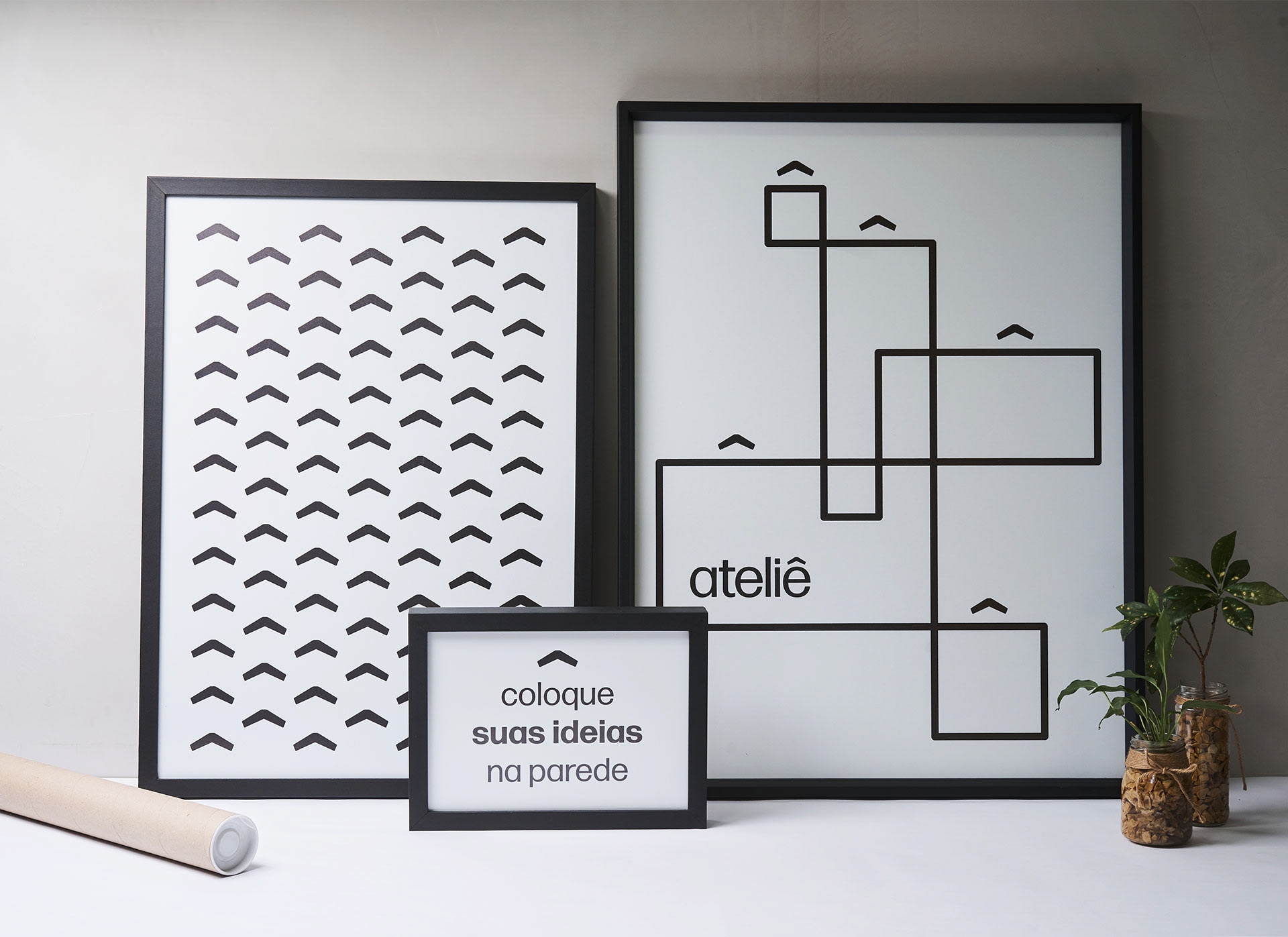
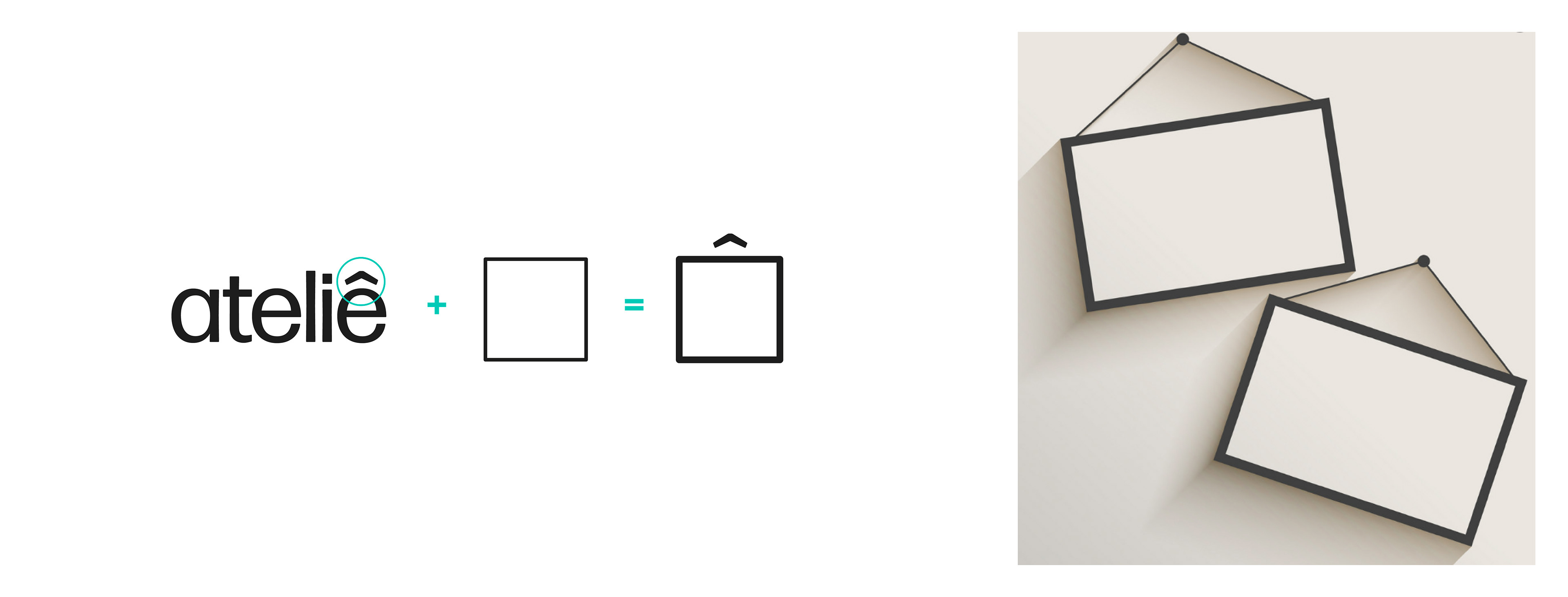
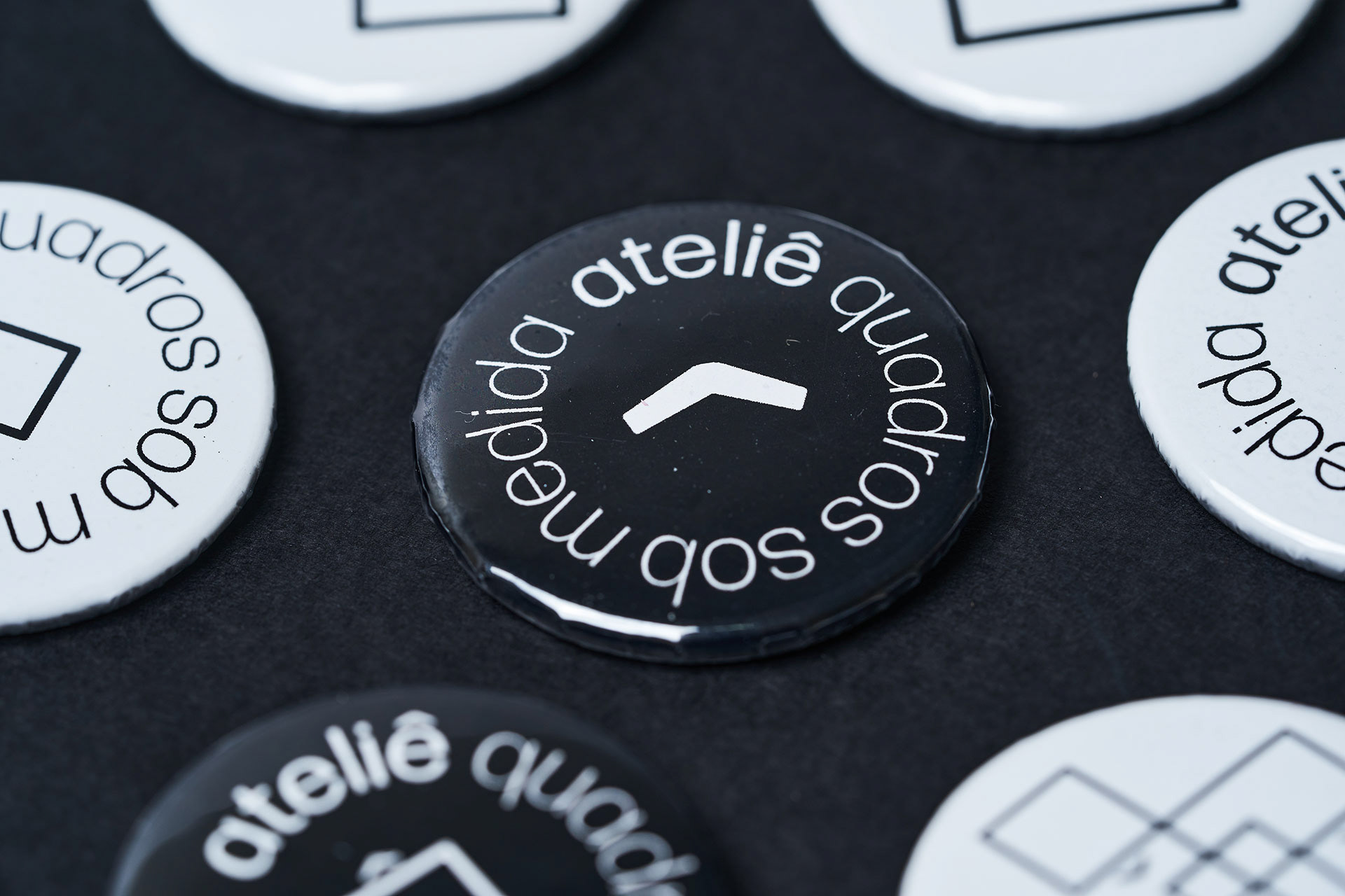
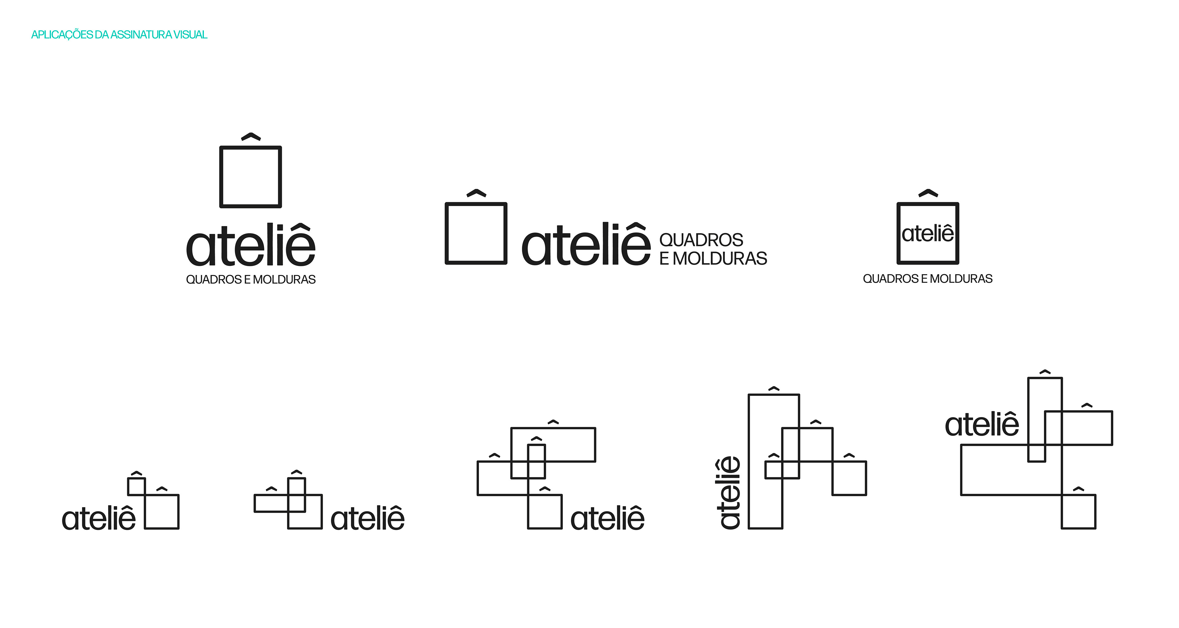
O acento circunflexo associado à um quadrado ancora o sentido da forma. Dá a sensação de que se trata de um quadro a ser pendurado na parede. O acento também se refere à ênfase e destaque, e confere mais personalidade ao ícone, afastando-se de uma solução visual genérica.
The accent ^ associated to a square anchors the sense of the form. Gives the sensation that it refers to a painting hanging on a wall. The accent also refers to the emphasis and highlight, and gives more personality to the icon, pulling the logo apart from a generic visual solution.
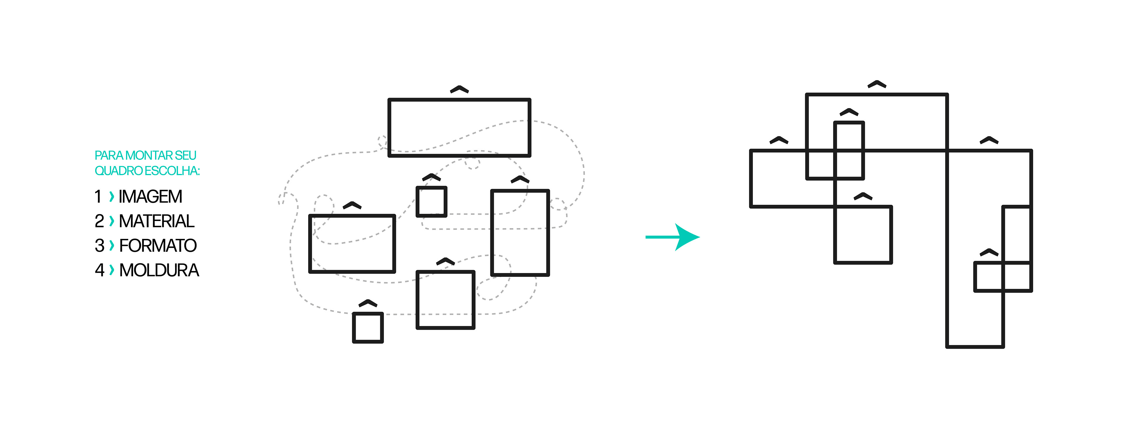
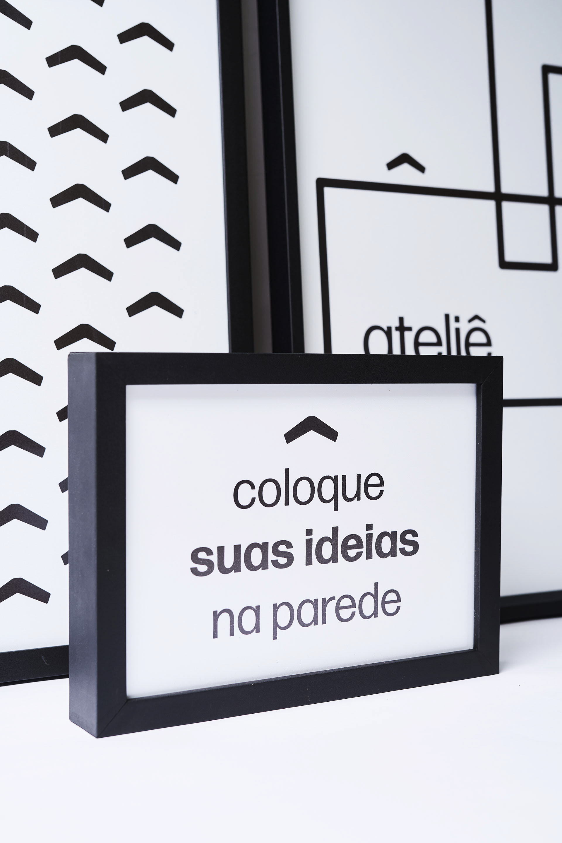
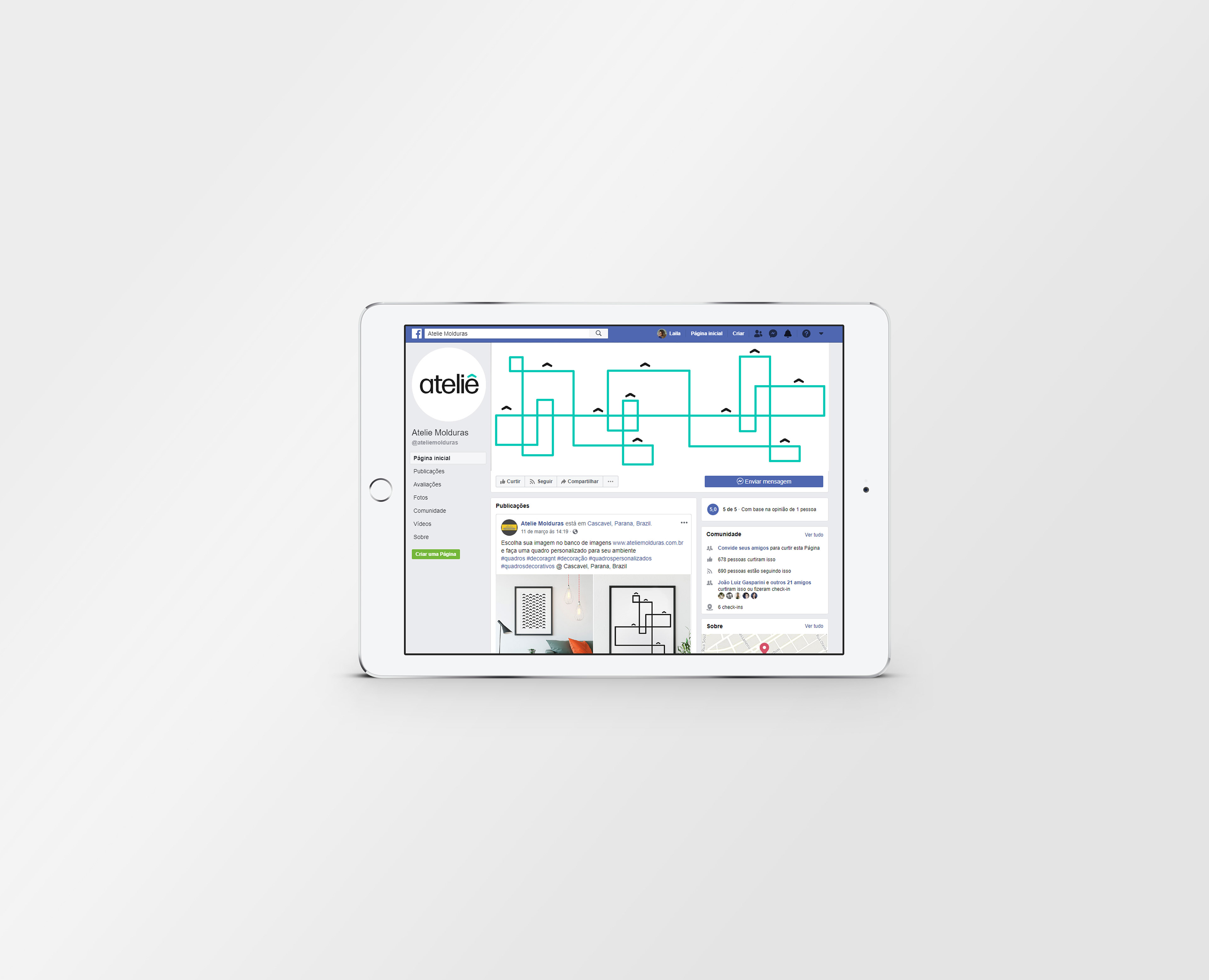
Como a marca Ateliê não é sobre 'um' quadro, e sim sobre as muitas possibilidades de quadros a serem criados, criamos uma marca dinâmica que pode assumir diferentes configurações.
Afinal, a marca é sobre os caminhos que você percorre para criar algo só seu. Uma linha que muda de direção a cada escolha, alterando o resultado da composição, tornando-o único. É sobre experimentar, explorar e criar novos resultados.
É sobre um movimento criativo que flui continuamente e se materializa na forma de quadros.
As the brand Ateliê is not about ‘one’ painting, rather about many possibilities of paintings to be made, we created a dynamic brand that can assume different configurations.
After all, the brand is about the paths you can take to create something unique. One line that changes direction at every choice, alternating the result on the composition, making it unique. It is about experimenting, exploring and creating new results.
It is about the creative movement that flows continuously and materializes on the form of paintings.
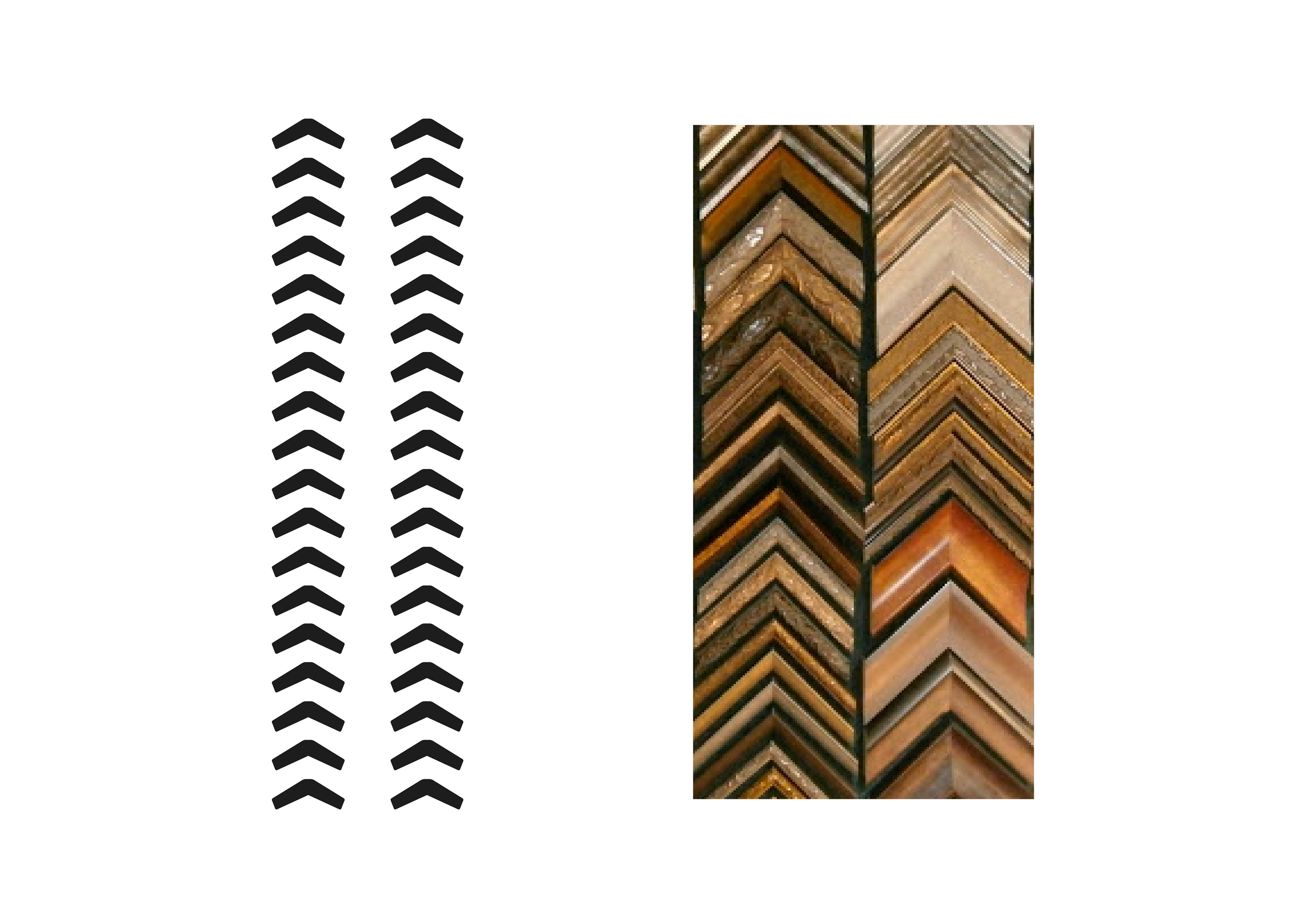
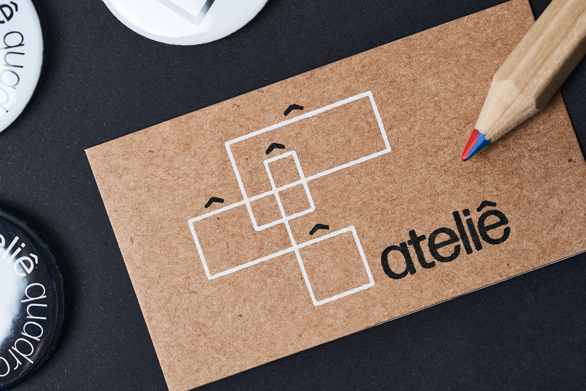
O acento, quando composto na forma de textura, faz referência visual às amostras de moldura tão características de uma loja desse segmento.
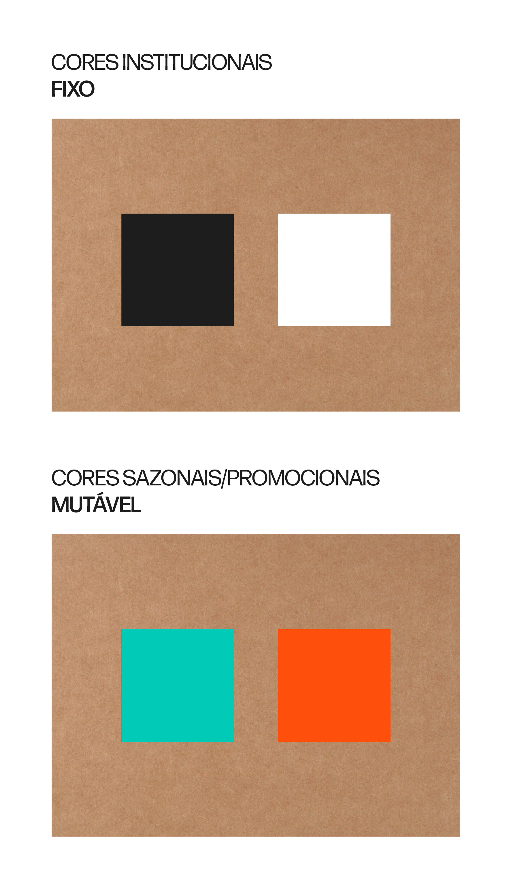
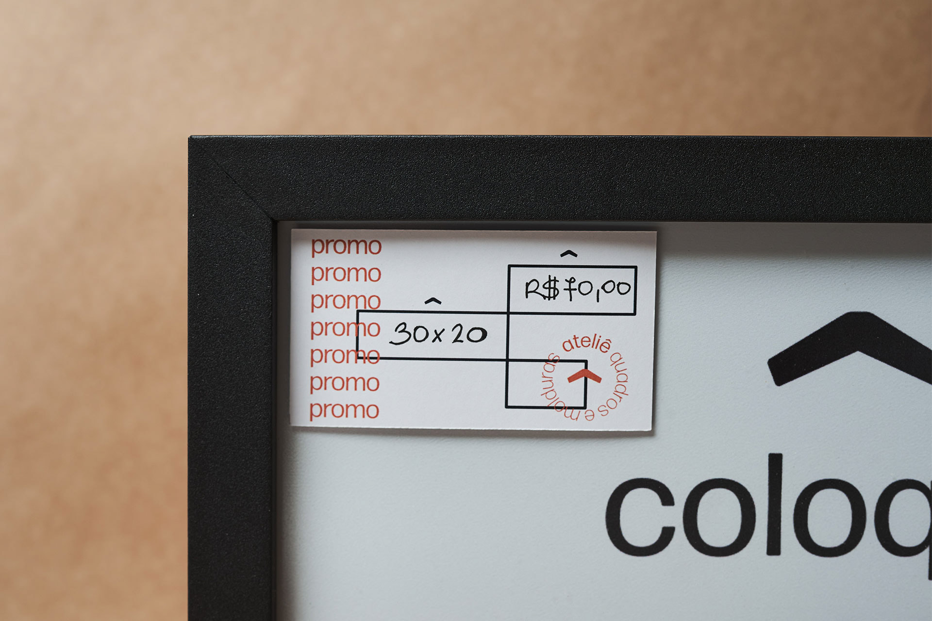
As cores escolhidas para as aplicações institucionais são preto e branco, preferencialmente aplicadas sobre papel kraft. Este material faz referência ao caráter artesanal - que evoca o sentido de personalização, mas também é amplamente utilizado nos acabamentos e embalagens dos quadros.
Para situações sazonais e promocionais, uma paleta de duas cores vibrantes que contrasta tanto com o preto, o branco e o kraft foi indicada, e também pode ser modificada ao longo do tempo.
The accent, when composed on the for of texture, makes visual reference to the samples of frames so characteristic of stores of this segment.
The colors chosen to institutional applications are black and white, preferably applied over kraft paper. This material makes reference to the artisanal character – that evokes the sense of personalization but also is widely used on finishes and packages of the paintings.
For seasonal situations and promotions, a two color palette that contrasts with the black, the white and the kraft was indicated, and can also be modified with time.


FICHA TÉCNICA:
Direção de arte e design: Laila Rotter Schmidt
Animação: Leonardo Prati
Fotos: Rodrigo Vieira

Prêmio de Ouro na FestGraf 2020 - Categoria Identidade Visual de Serviço
Prêmio GrandPrix na FestGraf 2020
Prêmio de Bronze no Festival do Clube de Criação do Paraná 2020 - Categoria Design Naming, Branding & Identidade Visual
Shortlist no Festival do Clube de Criação do Paraná 2020 - Categoria de Arte